目前很多应用都有侧滑菜单,最初的侧滑菜单很多都有SildingMenu,相信很多人都用的很熟。Google推出了自己人侧滑菜单DrawerLayout,相信很多人已经在用了。这里记录一下DrawerLayout的使用。
DrawerLayout目前大体有两种形式吧。
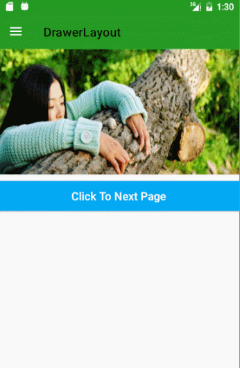
效果图 下面看一下效果图:
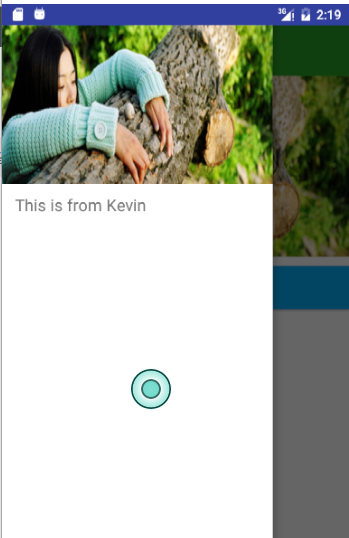
效果二
其实还有第三种效果,就是第一种的侧滑部分的状态栏加上。不过目前一般都是不带状态栏的,这样看起来效果会更好些。
两种效果其实写法都是一样的,只是ToolBar和DrawerLayout的布局位置不同而已。
布局代码
效果一布局
1
2
3
4
5
6
7
8
9
10
11
12
13
14
15
16
17
18
19
20
21
22
23
24
25
26
27
28
<?xml version="1.0" encoding="utf-8"?> <android.support.v4.widget.DrawerLayout xmlns:android ="http://schemas.android.com/apk/res/android" xmlns:app ="http://schemas.android.com/apk/res-auto" xmlns:tools ="http://schemas.android.com/tools" android:id ="@+id/drawer_layout" android:layout_width ="match_parent" android:layout_height ="match_parent" android:fitsSystemWindows ="true" <--这里一定要添加,否则状态栏颜色达不到你要的效果--> tools:context="com.student.kevin.drawerlayout.MainActivity"> <LinearLayout android:layout_width ="match_parent" android:layout_height ="match_parent" android:orientation ="vertical" > <android.support.v7.widget.Toolbar android:id ="@+id/tool_bar" android:layout_width ="match_parent" android:layout_height ="?attr/actionBarSize" android:layout_marginTop ="@dimen/topMargin" android:background ="@color/green" > </android.support.v7.widget.Toolbar > //...这里略去其他布局代码 </android.support.v4.widget.DrawerLayout >
效果二布局
1
2
3
4
5
6
7
8
9
10
11
12
13
14
15
16
17
18
19
20
21
22
<?xml version="1.0" encoding="utf-8"?> <LinearLayout xmlns:android="http://schemas.android.com/apk/res/android" android:layout_width="match_parent" android:layout_height="match_parent" android:orientation="vertical"> <android.support.v7.widget.Toolbar android:id="@+id/tool_bar" android:layout_width="match_parent" android:layout_height="?attr/actionBarSize" android:layout_marginTop="@dimen/topMargin" android:background="@color/blue"> </android.support.v7.widget.Toolbar> <android.support.v4.widget.DrawerLayout android:id="@+id/drawer_layout" android:layout_width="match_parent" android:layout_height="match_parent"> //...这里略去其他布局代码 </android.support.v4.widget.DrawerLayout> </LinearLayout>
当然,都是DrawerLayout+ToolBar,代码写法肯定是相同的。
代码 1 2 3 4 5 6 7 8 9 10 11 12 13 mToolbar = (Toolbar) findViewById(R.id.tool_bar); mToolbar.setTitle("Kevin" ); mToolbar.setTitleTextColor(ContextCompat.getColor(this , R.color.white)); setSupportActionBar(mToolbar); getSupportActionBar().setDisplayHomeAsUpEnabled(true ); mDrawerLayout = (DrawerLayout) findViewById(R.id.drawer_layout); mActionBarDrawerToggle = new ActionBarDrawerToggle(this , mDrawerLayout, mToolbar, R.string.drawer_layout_open, R.string.drawer_layout_close); mActionBarDrawerToggle.setDrawerIndicatorEnabled(true ); mActionBarDrawerToggle.setHomeAsUpIndicator(R.mipmap.ic_launcher); mActionBarDrawerToggle.syncState(); mDrawerLayout.setDrawerListener(mActionBarDrawerToggle); mDrawerLayout.setStatusBarBackgroundColor(ContextCompat.getColor(this , R.color.green));
上面代码就是DrawerLayout的基本使用
实现效果一
但是只使用这样的话达不到效果一的效果的,不过可以实现效果二。
添加代码 1 2 3 4 5 6 7 8 9 10 11 12 13 14 15 16 17 18 19 20 21 22 23 24 25 26 27 28 29 30 31 32 33 34 35 36 37 38 39 40 41 42 43 44 45 46 47 48 49 50 51 52 53 54 55 56 57 58 59 60 61 62 63 64 65 66 67 68 69 70 71 72 73 74 75 76 77 78 79 80 81 82 83 84 85 86 87 88 89 90 91 92 93 94 95 96 97 98 99 100 101 102 103 104 105 106 107 108 109 110 111 112 113 114 115 116 117 118 119 120 121 122 123 124 125 public class ScrimInsetsFrameLayout extends FrameLayout private Drawable mInsetForeground; private Rect mInsets; private Rect mTempRect = new Rect(); private OnInsetsCallback mOnInsetsCallback; public ScrimInsetsFrameLayout (Context context) super (context); init(context, null , 0 ); } public ScrimInsetsFrameLayout (Context context, AttributeSet attrs) super (context, attrs); init(context, attrs, 0 ); } public ScrimInsetsFrameLayout ( Context context, AttributeSet attrs, int defStyle) super (context, attrs, defStyle); init(context, attrs, defStyle); } private void init (Context context, AttributeSet attrs, int defStyle) final TypedArray a = context.obtainStyledAttributes(attrs, R.styleable.ScrimInsetsView, defStyle, 0 ); if (a == null ) { return ; } mInsetForeground = a.getDrawable( R.styleable.ScrimInsetsView_insetForeground); a.recycle(); setWillNotDraw(true ); } @Override protected boolean fitSystemWindows (Rect insets) mInsets = new Rect(insets); setWillNotDraw(mInsetForeground == null ); ViewCompat.postInvalidateOnAnimation(this ); if (mOnInsetsCallback != null ) { mOnInsetsCallback.onInsetsChanged(insets); } return true ; } @Override public void draw (Canvas canvas) super .draw(canvas); int width = getWidth(); int height = getHeight(); if (mInsets != null && mInsetForeground != null ) { int sc = canvas.save(); canvas.translate(getScrollX(), getScrollY()); mTempRect.set(0 , 0 , width, mInsets.top); mInsetForeground.setBounds(mTempRect); mInsetForeground.draw(canvas); mTempRect.set(0 , height - mInsets.bottom, width, height); mInsetForeground.setBounds(mTempRect); mInsetForeground.draw(canvas); mTempRect.set( 0 , mInsets.top, mInsets.left, height - mInsets.bottom); mInsetForeground.setBounds(mTempRect); mInsetForeground.draw(canvas); mTempRect.set( width - mInsets.right, mInsets.top, width, height - mInsets.bottom); mInsetForeground.setBounds(mTempRect); mInsetForeground.draw(canvas); canvas.restoreToCount(sc); } } @Override protected void onAttachedToWindow () super .onAttachedToWindow(); if (mInsetForeground != null ) { mInsetForeground.setCallback(this ); } } @Override protected void onDetachedFromWindow () super .onDetachedFromWindow(); if (mInsetForeground != null ) { mInsetForeground.setCallback(null ); } } public void setOnInsetsCallback (OnInsetsCallback onInsetsCallback) mOnInsetsCallback = onInsetsCallback; } public static interface OnInsetsCallback public void onInsetsChanged (Rect insets) } }
注:此类来自网上。
1 2 3 4 5 6 7 8 9 10 11 12 13 14 15 16 17 18 19 20 21 22 23 24 25 26 27 28 29 30 31 32 33 34 35 36 37 38 39 40 41 42 43 44 45 46 47 48 49 50 51 52 53 54 55 56 57 58 59 60 61 62 63 64 65 66 67 68 69 70 71 72 73 <?xml version="1.0" encoding="utf-8"?> <android.support.v4.widget.DrawerLayout xmlns:android ="http://schemas.android.com/apk/res/android" xmlns:app ="http://schemas.android.com/apk/res-auto" xmlns:tools ="http://schemas.android.com/tools" android:id ="@+id/drawer_layout" android:layout_width ="match_parent" android:layout_height ="match_parent" android:fitsSystemWindows ="true" tools:context ="com.student.kevin.drawerlayout.MainActivity" > <LinearLayout android:layout_width ="match_parent" android:layout_height ="match_parent" android:orientation ="vertical" > <android.support.v7.widget.Toolbar android:id ="@+id/tool_bar" android:layout_width ="match_parent" android:layout_height ="?attr/actionBarSize" android:layout_marginTop ="@dimen/topMargin" android:background ="@color/green" > </android.support.v7.widget.Toolbar > <ImageView android:layout_width ="match_parent" android:layout_height ="wrap_content" android:scaleType ="fitXY" android:src ="@drawable/icon_two" /> <Button android:id ="@+id/btn_next_page" android:layout_width ="match_parent" android:layout_height ="wrap_content" android:layout_marginTop ="10dp" android:background ="@color/blue" android:text ="Click To Next Page" android:textAllCaps ="false" android:textColor ="@color/white" android:textSize ="18sp" /> </LinearLayout > <com.student.kevin.drawerlayout.ScrimInsetsFrameLayout android:layout_width ="300dp" android:layout_height ="match_parent" android:layout_gravity ="start" android:background ="@color/white" android:fitsSystemWindows ="true" > <LinearLayout android:layout_width ="match_parent" android:layout_height ="match_parent" android:orientation ="vertical" > <ImageView android:id ="@+id/iv_menu_header" android:layout_width ="match_parent" android:layout_height ="wrap_content" android:scaleType ="fitXY" android:src ="@drawable/icon_two" /> <TextView android:id ="@+id/tv_menu_item" android:layout_width ="match_parent" android:layout_height ="wrap_content" android:layout_marginLeft ="15dp" android:layout_marginTop ="10dp" android:text ="@string/menu_tips" android:textSize ="18sp" /> </LinearLayout > </com.student.kevin.drawerlayout.ScrimInsetsFrameLayout > </android.support.v4.widget.DrawerLayout >
这个类的效果是让侧滑菜单的Menu区域延伸到状态栏。
主题设置: 在res/values-v21/styles中设置:1 2 3 4 5 6 <style name ="AppTheme" parent ="Theme.AppCompat.Light.NoActionBar" > <item name ="android:windowDrawsSystemBarBackgrounds" > true</item > <item name ="android:statusBarColor" > @android:color/transparent</item > <item name ="drawerArrowStyle" > @style/DrawerArrowStyle</item > //set the title color,设置toolbar标题颜色 </style >
好了这样就达到效果了。效果二和三就不用写了,因为效果一中减少一些设置就可以达到效果二和效果三了。
DrawerArrowToggle颜色和动画的设置 1 2 3 4 <style name ="DrawerArrowStyle" parent ="Widget.AppCompat.DrawerArrowToggle" > <item name ="spinBars" > true</item > //true就会有旋转动画,false就不会有旋转动画 <item name ="color" > @android:color/white</item > //默认是黑色,这里设置为白色 </style >
如果需要的话可以看看。:-)
有CSDN的可以下载一,没有的可以下载github。看方便喽
Demo下载